Thursday 17 April 2014

Evaluation: Question 1

 How effective is the combination of your main product and ancillary text ?

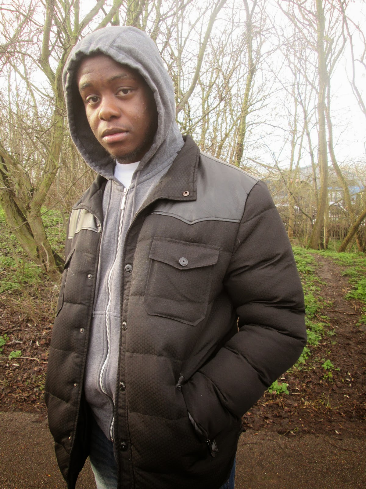
I feel that our ancillary task suits our final product well as the film poster both uses the same typography in the title of the trailer the font 'most wanted' was used the main product and ancillary text to show an immediate connection between the three. The style the character is dressed in the poster and independent film magazine relates to the social realism trailer of that young urban street look. Also having the model pictured in a hood in both the ancillary text relates to the title of the trailer 'Dreamz in the Hood', it was important that we kept our target audience the same through out our ancillary text and main product. We didnt want our trailer appealing to a younger audience and then our poster and magazine appealing to a elderly audience. The use of  graffiti was used in both the main product and poster to maintain the nature of the products youthfulness show the continuation from the trailer to the poster.


From looking at 'sight and sound' magazines I captured the idea of putting the name of my trailer in the middle of the magazine to let the audience aware of the connection between the indepedent magazine, poster and trailer. Originally I did not insert the name of my film on the magazine but through group discussions we felt that the independent film magazine did not really show a clear combination of the 3 products as it didn't mention the title letting the audience be aware that this independent magazine was created from the features of the trailer.


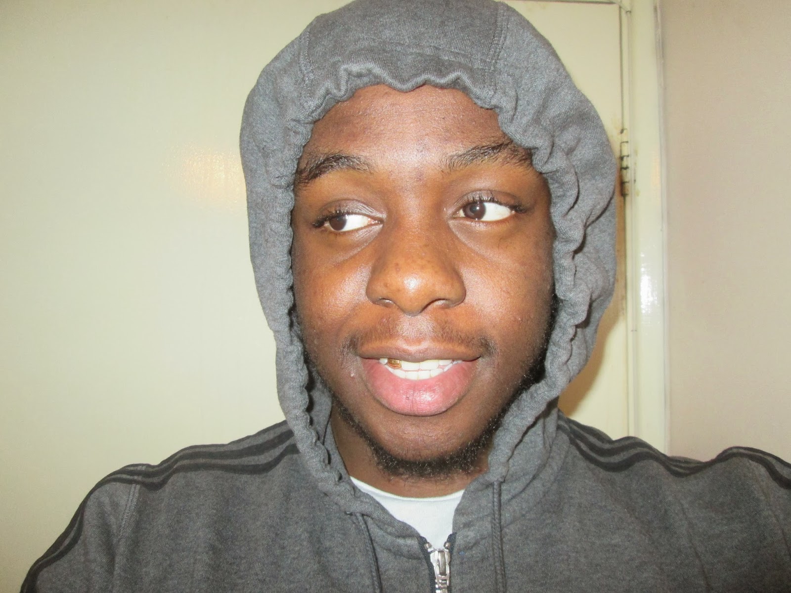
I liked the layout of having the film title across the main image however one thing I felt was that the magazine would need use colours that will convey the genre of the trailer and match the colour scheme used through out the ancillary text and the main product.We also decided to use the protagonist character from the trailer in the magazine and in the poster to show consistency and a clear connection between our main product and ancillary task. Furthermore in the trailer our protagonist character is seen to be wearing hooded jumpers which is stereotypical worn by young teens with some sort of gang affiliation, it is evident by looking at the poster and independent film magazine that we imported the 'Hoody' theme in the ancillary. The 'Hoody Theme' links to our target audience as hoody's are the trend and day to day clothing of the youth, and as they are affordable and not out of their price range they are accessable to the youth. Also the media has enforced a moral panic on society as it exaggerates hooded clothing regards youths as outlaws and a challenge to authority and tries to marginalise the youth from society, which we imported that moral panic into our trailer seeing the youths marginalised in socicety and gang relations. We imported scenes from the trailer and placed them into the poster making it evident that the poster is related to the trailer, and in the poster we got same font which is used in the independent magazine which also shows a relationship between the two ancillary text and the main product. Also the same escapism  theme is seen throughout all our products.


We challenged stereotypes of females as they are normally seen as uneducated and usually dressed in provocative clothing, however this was not the case as in our trailer as we formed our female character to present her self in a more respectful manor and was in this case more educated than the male. we linked our story line to Levis Strausse's theory of 'Binary Opposition' Good vs Evil, Girl vs Boy etc. In our trailer the use of binary opposition we made was good vs evil as the girl played the good samaritan trying to encourage her boyfriend to make the right choices and focus on his career rather than living for the streets. we also used the binary opposition theory in the independent magazine, showing the contrast in colours where the characters colour was manipulated to look bright and stand out  and  made the background block of flats look dark to convey many meanings like for example the dark grey block of flats may anchor the theme of pain and struggle while the main image of the model to is brighter may convey theme of hope and escapism .


As you can see using this fish tank example, the 2 ancillary text relate to the main trailer by them using the protagonist character on the front cover of both of them which makes viewers immediately think of the trailer when they look at the poster and magazine.Also the way the character is dressed in both ancillary represents the working class culture the fish tank trailer portrays.

Monday 14 April 2014

Evaluation: Question 2


Evaluation: Question 3

Here are my evaluation vlogs. My evaluation question was "In what ways does your media product use, develop or challenge forms and conventions of existing media products" I have chosen to split my vlogs into 3, each focusing on our individual products.
This vlog focuses solely on our film poster:


This vlog focuses solely on our film trailer:


This vlog focuses solely on our independent film magazine:


Evaluation: Question 4

Sunday 13 April 2014

Independent Film Magazine Final Draft

'Dreamz in the Hood' Independent Film Magazine: Alternative Version


Created by Abena Amoako

'Dreamz in the Hood' Trailer: Final Draft


DREAMZ IN THE HOOD draft 3 from Media @ St. Bons on Vimeo.

Independent Magazine: From First to Final Draft

This was my first draft of my independent magazine.We chose this photo because it is centrally framed and it has eye contact with the audience which enforces its mode of address which i thought was useful as a front cover of a magazine has to engage with its target audience. i decided to keep this draft quite simple to follow the conventions of a independent film magazine by keeping the sell lines to a minimal. Also with the typography I tried to design it in a way it looks youthful to allow me to connect with my target audience


This is my second draft of my independent film magazine. As you can see I changed the background to my image as I thought the woods in my first draft didn't anchor my genre as much. However I replaced my previous background with an block of flats estate which through research anchors my genre well, also i thought adding a sell line making it clear to my audience that my magazine is a independent film magazine. I kept the typography the same but had a little play about with the colour scheme and changed my masthead colour to black which was previously blue. The reason for my change in colour is because I wanted to keep my colours consistent and just use 3 different colours as in comparison to my first draft i used a range of colours which doesn't make my magazine colour scheme consistent.


This is my final version to my independent film magazine and there is evident progression from my first and second draft to my final version. As you can see from the three pieces I have kept the same image but have just manipulated it more and more, the difference between this image from my second draft is that I manipulated the complexion of my face making it much more clearer as I thought in my first and second draft my complexion looked quite dull due to the poor quality of the camera but I made full good use of the Photoshop software and  solved the problem .Furthermore I made some changes to my background, I kept the same image but manipulated the colour and tuned down the colour making it look gloomy and less exotic as in my second draft the bright colours didn't really anchor my genre as much as I wanted it too. The dark colour scheme conveys my story line and its mainstream convention of the social realism genre. Due to the change in colour to my background my masthead colour had to change and couldn't stay black because it would clash with the background making the clarity difficult to recognise. However I researched colour schemes online and found out that red is a brilliant colour on black as it has various meanings like 'love and hate', 'danger and fate' etc. I changed the colour scheme from my previous draft as I thought the change was inevitable but I am contempt with my new colour scheme.


Created by Sean Okpa

'Dreamz in the Hood' Poster: Final Draft


Feedback on the Independent Film Magazine

Myah - Good image, maybe decrease the size to reveal more of the background.

Nadia - The background should anchor the genre more, woodland connotes a horror film more than a social realism film. 

David - I think you should ad graffiti similar to the one used at the end of your trailer to help create more of a brand.

Enzo - Very significant improvements from the first draft. The background and the font used anchors the genre very clearly, I can instantly tell this is a social  realism film.

Development of Independent Magazine

This is the image of our protagonist in our trailer 'Dreamz in the Hood' that I have selected to be used as the cover of our independent film magazine. As it stands the image is pretty basic, it was constructing in a Greenway hence the trees in the background and we don't feel as though it is a good representation of a independent film magazine therefore would need a lot of manipulation to fulfill what we aim to create which I will do in Photoshop. 

After opening the image into Photoshop I began manipulating. I went to Image then clicked "desaturate". This turns the the coloured image into a black and white image which was necessary for the effect I planned on using. I then moved the contrast tool to "76" and the brightness tool to "-51" as I wanted the image to be clear and not too over powered by light as more effects were to be further added.

Next, I added my chosen effect onto the desaturated image. I went to "Filter", "Sketch" and then chose the "Note Paper" filter. I then had to further adjust the "Image Balance" which I moved to '7', the "Graininess" which I adjusted to '3' and the "Relief" which i adjusted to '3' also. This was all chosen down to preference as although I wanted the effect to be prominent, I also wanted the image to remain detectable.

To further develop this effect, I went to "Image", "Adjustments" and then clicked on the "Hue and Saturation" tool. I then clicked "colorize" which would allow me to adapt the colour of my image. I had chosen a blue shade which was hue '238' and then adjusted the saturation to '56' and the lightness to '0' which was a good median and didn't deduct from the image.

I wanted to further adapt this image and create a more artistic effect on the image. I did this by going to "filter", then "filter gallery". I selected the "ink outlines" filter which created a more defined image. I moved the "stroke length" to '4', "Dark Intensity" to '20' and "Light Intensity" to '10' so the light would balance the darker elements on the image as seen above.


I then decided to add other external features onto the front cover of the Independent Film Magazine. This
included a "barcode" which I added in a circle which I created using the "Elipse Tool". I used this to also add the title of the film magazine which was influenced by the 'Little White Lies' magazine. I also added the price of the magazine which is a convention of any magazine as consumers need to be made aware of how much they have to pay for the product.


Lastly, I focused on the title 'Dreamz in the Hood'. I wanted the title to replicate the one seen on the actual 'Dreamz in the Hood' poster. This way my audience will be able to identify with our film through the magazine

Saturday 12 April 2014

Feedback of Independent magazine

The magazine was very good in terms of the conventions of an independent magazine however I don't think its a magazine that portrays our film in terms of its story line. It doesn't really sell the story as there is nothing on it that seems appealing to the audience.

Wednesday 9 April 2014

Feedback on the Film Poster

During class, we presented our Film Poster to our peers and asked them for positive or negative feedback and here were the results.

Sean Oyebanjo - I like the use of the critical success positioned on the film poster. It gives it a realistic effect which would certainly make me want to watch the film more.

Jennifer Torres - I like the effects used on the four images placed at the bottom of the poster, it shows the whole cast as well as the main image of the protagonist. It also fits in with the title of the film  'Dreamz In The Hood' as it gives the images a dreamy effect.

David George - I think the background should be of a more urban setting, which would allow the audience to identify the genre of the film as soon as they see the poster.

Friday 28 February 2014

Voice Over Edit


In some of our scenes especially at the start of our trailers where we have one of our characters hurt after being attacked, there was a problem because we had dialogue and the trailer introduction track playing at the same time. We used a programme called 'Audacity' which allows you to lower or increase the voices of your characters. In our situation we increases the voices of our characters and then decreased the introduction track while on after effects.

Colour Pallet Process


Once you see the trailer, you will notice the black and white colour pallet in the first few shots. This was done to portray all the times our protagonist, Remel, has bad intentions or to show his troubled environment.

1.Go to edit > Preference > General

2.Check 'use system colour picker' option

3.Now you will get a selection of colour pallets as you can see on the final image.

Introduction Origin and Development


The original logo we had chosen was still the logo we wanted to keep however the logo itself wasn't big enough so we had to think of a plan B. We decided to surf the internet and look for a wheel and use photoshop to change it to the colour black which is what you see in image 2. Image 3 was basically the animation process on the left using after effects. This was vital to the introduction of our trailer. By using the search bar you can find and apply effects and presets. Then you go to effects and select an effect you like via the various features available in After Effects. Although the rendering process took really long once we had finished the animation process, the end product was worthwhile. This was largely based to getting key frames and timing to perfection.

Brick Wall Origin


There's a sequence in the trailer whereby the audience will encounter a brick wall with the cast names on it. We chose a brick wall to represent the hood and usually brick walls are used in the hood for graffiti so our names was basically the graffiti. We got the image from the internet and we just did a few size changes and slanted the image a bit using photoshop cs4.

Saturday 15 February 2014

'Dreamz' in the Hood' Poster: Draft 4


Dreamz in the Hood Trailer: Draft 2


TRAILER HALF WAY from Media @ St. Bons on Vimeo.

Here we are at the half way stage of our trailer, Just needs a little editing here and there in terms of more dialog footage but at this stage, we are track on what we are trying to portray.

Monday 10 February 2014

Dreamz in the Hood Poster - Draft 3

Created by Abena Amoako
This is the second draft of the 'Dreamz in the Hood' poster that I have created. There has been a significant improvement in the development of this poster since the first draft as I have included more of the necessary conventions that is required of a film poster.

On this update I included our film title 'Dreamz in the Hood' which I decided to place centrally as it will draw my target audiences attention to the actual film so that  they remember the purpose of the poster rather than being distracted by the other features on the poster.

Because there are other dominating features on the poster such as the tag line, images and title I wanted to keep any additional features at a minimum. Through researching other existing social realism posters such as 'Shifty' and 'Bullet Boy' I noticed that a common convention was the critical ratings that the films received. For this reason I added two ratings, one five star and the other four by 'Empire' magazine and 'the Guardian' which are often seen to give ratings to films of this genre. I felt as though handwriting this in a graffiti type font using the 'pen tool' further anchored the social realism genre as graffiti usually has connotations of less developed areas or "the hood".

To this updated version, I also added names of the main actors at the top of the poster. This will further attract an audience to the watching the film as people become interested in the performance of the actors within the film, especially if they have identified with them elsewhere previously.

Friday 31 January 2014

Dreamz in the Hood Trailer: Draft 1


Realist productions from Media @ St. Bons on Vimeo.

This is the first draft of our trailer, which we intend to use as a guideline in further production of our actual trailer. We will collect feedback and try and improve on areas we lacked in.

Thursday 30 January 2014

Independent Film Magazine: Front Cover Selection

This is one of the photos I was considering to use for my independent magazine front cover. However down to a strong and hard thought about it i didn't end up using because I thought that my facial expression looked to serious which may put off some viewers. Also the posture may appeal to the male audience as it portrays a violence and aggression and disregard the female audience
With this photo I liked it because of the clarity of  it as it is vital to have a clear photo on the front cover. Also unlike the first photo my facial expression does not look to serious at all, appealing to both male and female audience which is the aim of every magazine, to try to appeal to as much people as it can to gain more recognition. However I did not use it because I am not giving eye contact to the camera, I'm looking away from the lens. I personally believe the best way to gain an audience attention is through eye contact which is why I didn't end up using the photo.
 This is the photo i chose to be for my front cover. I chose this photo for many reasons, the clarity which I said before is important, my facial expression is composed  and also the background. The difference between this picture and the others is that this picture has an background that connotes my genre which is 'social realism'  the leafless trees in the woods connotes poverty and struggle and through that there is a pathway which metaphorically leads me to my 'dreams' which relates back to the title of the movie.

Casting


Ramel, played by Sean Okpa – Protagonist - Perfect actor for the main role has good knowledge of the social realism genre conventions. He has a big decision to make, go to the talent show or go and back his boys that need his help. What does he chose? His hood reputation or his passion.

Femi, played by Solomon Ssenyonga & Keiron, played by Kortney Hudson – Boy with no ambition. Dragging Seans character into the wrong path. Back Sean’s character with his music but they are also heavily involved in the hood life and not intentionally knock Sean off the right path, or does he?

Stacey, played by Abena Amoako – 'Ramels' girlfriend who wants him to leave the life he lives and focus on his dream to become a rapper so that they both have a good future

Adam Deacon – A well known British actor; mainly known for his roles in British social realism films such as Kidulthood, Adulthood and Shank. Adam is very experienced in playing these particular roles because he himself came from urban London; he is a young actor and can act out various roles.


Ashley Walters – Known for his roles in Bullet Boy, Top Boy and even 50 Cent’s Get Rich Or Die Tryin’. Ashley also came from Hackney which is known for being a rough area. So Ashley finds joy in acting in social realism films which explore themes of his past.


Noel Clark – Noel Clark would be a great asset to our cast as we would get a three in one man who directs acts and writes scripts. Noel is most known for his roles in ‘Kidulthood’ and ‘Adulthood’. Noel also known for his roles in 'Auf Wiedersehen', Pet and well-loved British Drama ‘Doctor Who’.

We have been inspired by these actors and wish to portray similar characterizations when acting in our trailer.


Monday 20 January 2014

Script & Voice Over Treatment

*Sound track plays*

*After Kieron has been stabbed* 

Femi: Ay Kieron are you alright?

Kieron: Yeah bro I'm fine, go catch  Rymel, go catch Rymel.

*sound fades to silence*

*New soundtrack plays in background*

Kia: Rymel are you alright?

Rymel: How can I  be alright when them paigons touched Kieron?

Kia: Are you still going to do the talent show?

Rymel: I'm not trying to hear the talent show right now, I want revenge.

Possible Voice over..

From where they never make it, Realist Productions brings you the hard hitting, controversy riddled, drama of three friends, two paths and one girlfriend. Who are all Dreaming beyond the hood but in different ways..

Dreamz In The Hood, coming to a Cinema near you!


Tuesday 7 January 2014

Importing of Footage

We imported the footage on After Effects and worked on constructing our trailer. After importing our footage, we consulted our animated story board to make our trailer as best and as structured as possible.
Importing our footage was simple enough as we filmed using a digital camera and through the advances in technology we were able to move the footage from the camera using a single wire.

Created by Kortney Hudson

Wednesday 1 January 2014

Working Titles in Trailers

Here we see a mixture of working titles from social realist film trailers below. The use of different fonts and sizes which really do come out towards the screen is something the group will try to do. The first picture is a sneak preview of the trailer being made and how the group has tried to add working titles.
Created by Solomon Ssenyonga


These are all examples of working titles in Social Realism films we felt would be beneficial to analyse in order to develop our own. From these selected titles, it can be detected that the background in which they are displayed are of a plain and dark colour palette. I assume this is to enhance the effect of the title and to make sure that this stands out to the audience rather than being distracted from other features such as busy backgrounds.

We are also created our trailer on a low production budget, as of many other social realism films and so it is not necessarily expected of us to create an exaggerated title which wont particularly suit our genre.

Created by Abena Amoako

Wednesday 4 December 2013

Costume Research


This Nike bomber jacket is mostly worn by youth with street affiliation. With what I have seen myself  in reality and in social realism movies this jacket is commonly worn by them, mainly because of the puffiness of the jacket and the secret pockets embedded in the coat which maybe used for storage for illegal items. The hood is very big as well which enable the users to pull over their face to not reveal their identity while committing crime.


In this mood board I picked out a range of pictures from different social realism films to help understand my costume arrangement for my characters in the trailer. 
From my mood board  I Inferred that hooded clothing  are stereotypically worn by mainly the Afro-Caribbean ethnic  group. Hoodies are seen to be quite intimidating . The media has left a negative stamp on the young generation by labelling hoodie-wearing teenagers as suspicious and sign of intent to commit a crime
When adults see a young person wearing a hoodie they automatically stereotype the teen as “thug” or a “trouble maker” the media has exaggerated the stereotype of hoodies  so much that it created a moral panic in some societies.
People forget the real reason for the wearing of hoodies for example to  feel comfortable and warm during cold weathers.
social realism films 99% of the time if not all the time conform to the negative stereotypes of hoodies, for example the protagonist characters that are seen wearing hoodies are normally up to no good. If you go  back to my mood board you will see a picture taken from the movie “shank” on the bottom left, which shows a group of teens hooded up armed with harmful weapons and obviously the body gestures of the group suggest to the viewers that they have a negative motive.


Evidence
    Also the protagonist characters are generally from a  lower social class,  which is shown by their costumes and  mise-en-scene of the area. In the social realism pictures I have shown the female actresses  conform to the stereotype of an average female from a materially  deprived family which are conveyed to be quite trashy and ‘ratchet’.  ‘Ratchet’  is an urban term used to describe ‘A diva, mostly from urban cities and ghettos, that has reason to believe she is every mans eye candy. Unfortunately, she's wrong’ (www.urbandictionary.com
Challenging the stereotypes

In my trailer my male protagonist characters are going to conform to the stereotype in the way they are dressed. The reason I am conforming is because  the way social realist films dress up their male characters is the same way some dress in today's modern society, especially in the area my trailer is located the dress sense is very common. For example a hooded jumper,  tracksuit bottoms and casual trainers

I am going to challenge the way females are portrayed in social realist films. In most social realist films females are dressed up in ‘trashy’ clothing for example wearing tracksuits and hats like as you see in the image below


normally the females that are dressed up in that kind of way it influences their lifestyle and  results in  having no ambition and conform to the stereotype of women dependency on men. But  in my trailer I am to challenge that  stereotype  by dressing up my female character in decent clothing as females are starting to become more independent than in the past and also having ambitions and wanting to play a part in the bread winning role which known to be played by men alone.


Tuesday 3 December 2013

Colour Scheme


Here is a selection of pictures of colour schemes the group is considering to pick.

Magic of DAfont


Here I used the fonts from DAfont so i can apply them in the group's trailer. I done by downloading the fonts from DAfont then installing them on computer system which enabled me to apply them in trailer as they were in the list of fonts available on Adobe After Effects CS4.

Poster Sketch


The main character is in the foreground to convey his importance and centrally framed to add emphasis on the male, the dominant role. The knife in the characters hand is there to symbolise his wayward lifestyle and the microphone is in binary opposition to that by conveying his dreams, faith and hope to escape his from his lifestyle that may lead him near death on in prison. As you can see I placed his girlfriend on the right where his microphone is showing her support of him to abandon his negative lifestyle and focus on his talent he posses which is rap and follow his dreams, and his friends that influence him negatively are deliberately positioned on the left side where the knife is to show how they support his bad lifestyle and want him to carry on going down the road his going and not in support of his dreams.

Created by Sean Okpa


This is my sketch of a possible design that we could use when creating our poster. I envisioned splitting the poster into two; the city of London which I represented by using images of the Shard and Gherkin and the city of London where our protagonist lives. I also wanted to illustrate the hypothetical 'split path' that our protagonist could take in a literal way. I did this by drawing a path with split roads leading to his friends or his pregnant girlfriend. I aimed to implement the purpose of are trailer which is dreams and escapism through every aspect of our poster, including the title. I focused on having 'Dream' in a dreamy or bubbly font which would connotate the happiness of a dream whereas the 'Z' was written in the same italic handwriting as 'the hood' which would add edge to the title which I believe our film represents.


Comparing my sketch to an existing Social Realism poster, I've reevaluated what I expect to be on our poster. The Shifty Poster doesn't detract from the main characters as it is on a very plain background whereas on the poster I had designed there was a lot to focus on from the buildings to the main character to his friends and girlfriend. On my poster design, I focused too much on the actual images and including a title, rather than including the other necessary conventions of a film poster such as the film ratings and sell lines.

Created by Abena Amoako